Chapter 5: Data Visualisation with ggplot2
Goals:
Create and customize visualizations using ggplot2.
• Basics of ggplot2
• Make a scatterplot, boxplot and column graph
• Customise labels, themes, and colors.
R is a powerful tool for visualisation. Base R has its own graphing functions, but it’s. honestly a bit too simple and ugly for publication. ggplot2 is perhaps the most commonly used package. A more detailed resource can be found here.
ggplot will be split across two chapters. The first will be the fundamentals for making figures, and the next chapter will have notes on detailed customisations.
Read time: 20 Minutes
Basics of ggplot2
ggplot2 is simply an expansive toolbox of graphics and functions that you may combine in infinitely unique ways to create figures for your specific needs and liking.
The design of a ggplot graphic is that it is built in layers:
- Start with the raw input data: which object will you use? Which columns will be on the x, y, will be grouped, will be used for colours?
- Next, define how the data will be plotted - scatterplot, violin, column, boxplot, heatmap, density etc.
- Add layers. Add titles? Add a caption? Change the colour palette? Change the theme?
data: The information you want to visualise.
layer collection of geometric elements and statistical transformations
aesthetic attributes: color, shape, size (aes)
geometric objects: points, lines, bars (geom for short)
statistical transformation: summary of the data (e.g. binning in a histogram) (stat for short)
mapping: description of how the variables are mapped to aesthetic attributes
facet: how to break up and display subsets of data
theme: the finer points of display, like font size and background colour
Example Question
What is the relationship between CCR5 and HLA-DR percentages in human tissues?
Scatterplot
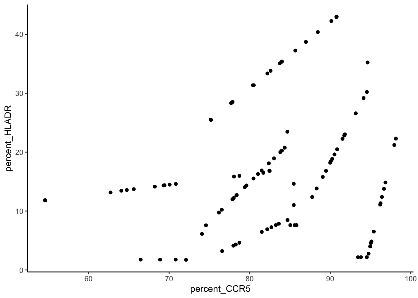
Using this example we’ll look at how the percentage of CCR5 and HLA-DR are correlated in this dataset.
Code
setwd("~/Desktop/analysis-user-group/")
data <- read.csv("~/Desktop/analysis-user-group/synthetic_data.csv")
Code
data %>%
  mutate(percent_CCR5 = 100*CCR5/CD4,
         percent_HLADR = 100*HLADR/CD4) %>%
  ggplot(aes(x = percent_CCR5, y = percent_HLADR))+
  geom_point()
You don’t need to use pipes for ggplot:
This will also work:
Code
data <- data %>% mutate(percent_CCR5 = 100*CCR5/CD4,
         percent_HLADR = 100*HLADR/CD4)
ggplot(data, aes(x = percent_CCR5, y = percent_HLADR))+
  geom_point()
Lets start with a few aesthetic things. I’ll build these sequentially and point out what is changing each time.
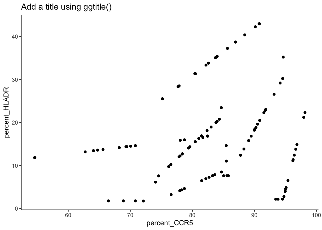
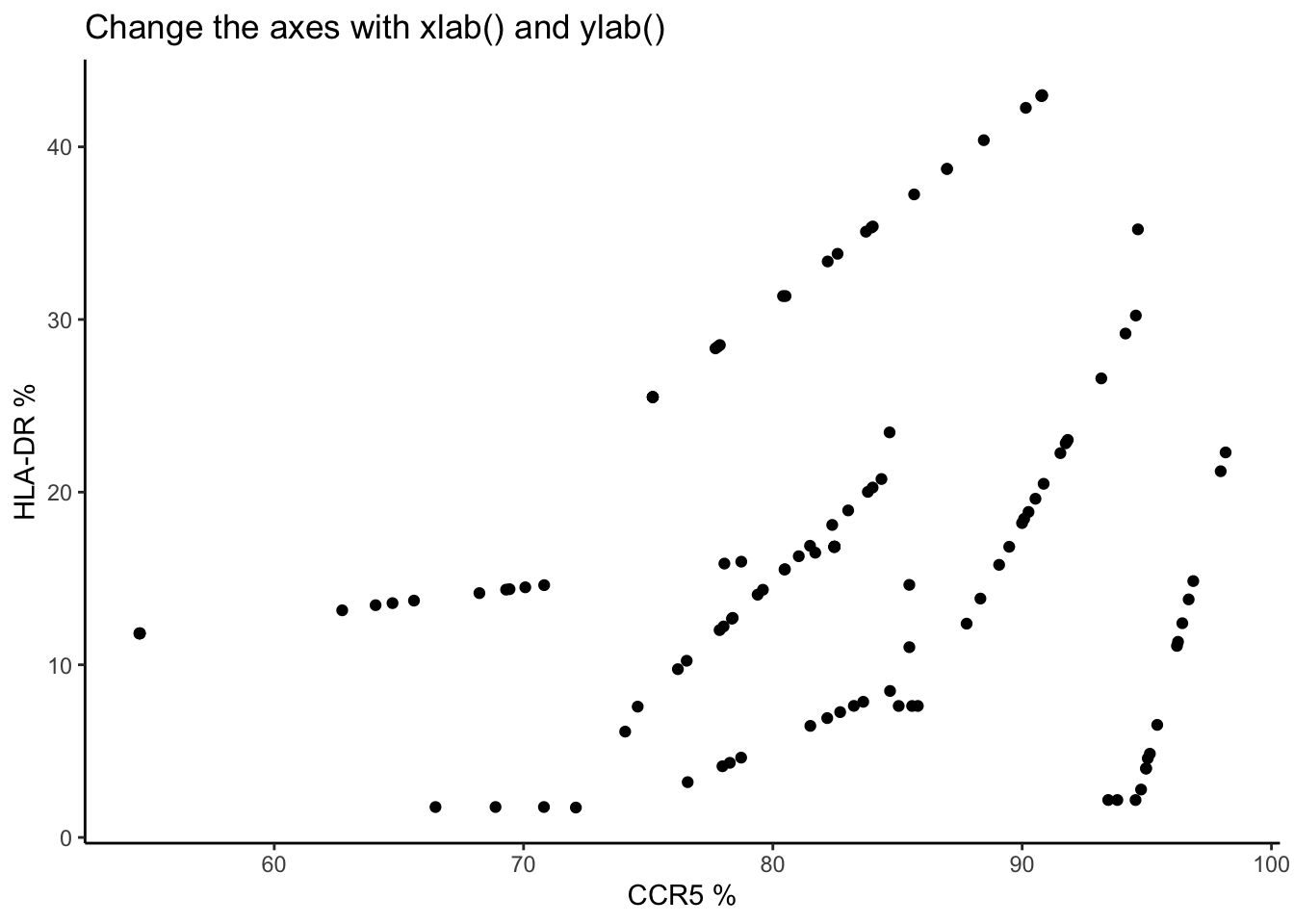
Change the titles and axes:
Code
data %>%
  mutate(percent_CCR5 = 100*CCR5/CD4,
         percent_HLADR = 100*HLADR/CD4) %>%
  ggplot(aes(x = percent_CCR5, y = percent_HLADR))+
  geom_point() +
  ggtitle("Add a title using ggtitle()")
Code
data %>%
  mutate(percent_CCR5 = 100*CCR5/CD4,
         percent_HLADR = 100*HLADR/CD4) %>%
  ggplot(aes(x = percent_CCR5, y = percent_HLADR))+
  geom_point() +
  ggtitle("Change the axes with xlab() and ylab()")+
  xlab("CCR5 %")+ylab("HLA-DR %")
Code
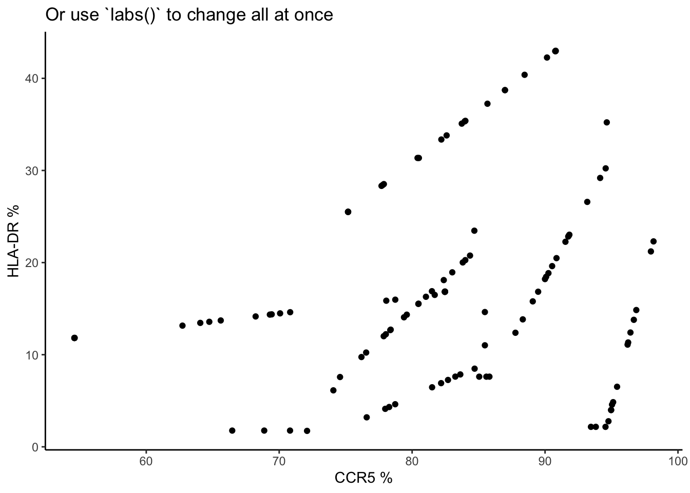
data %>%
  mutate(percent_CCR5 = 100*CCR5/CD4,
         percent_HLADR = 100*HLADR/CD4) %>%
  ggplot(aes(x = percent_CCR5, y = percent_HLADR))+
  geom_point() +
  labs(title = "Or use `labs()` to change all at once", x= "CCR5 %", y= "HLA-DR %")
Change the overall layout:
Use theme_ to test out different styles. Here are my three most commonly used.
Code
data %>%
  mutate(percent_CCR5 = 100*CCR5/CD4,
         percent_HLADR = 100*HLADR/CD4) %>%
  ggplot(aes(x = percent_CCR5, y = percent_HLADR))+
  geom_point() +
  labs(title = "theme_classic()", x= "CCR5 %", y= "HLA-DR %")+
  theme_classic()

Code
data %>%
mutate(percent_CCR5 = 100*CCR5/CD4,
percent_HLADR = 100*HLADR/CD4) %>%
ggplot(aes(x = percent_CCR5, y = percent_HLADR))+
geom_point() +
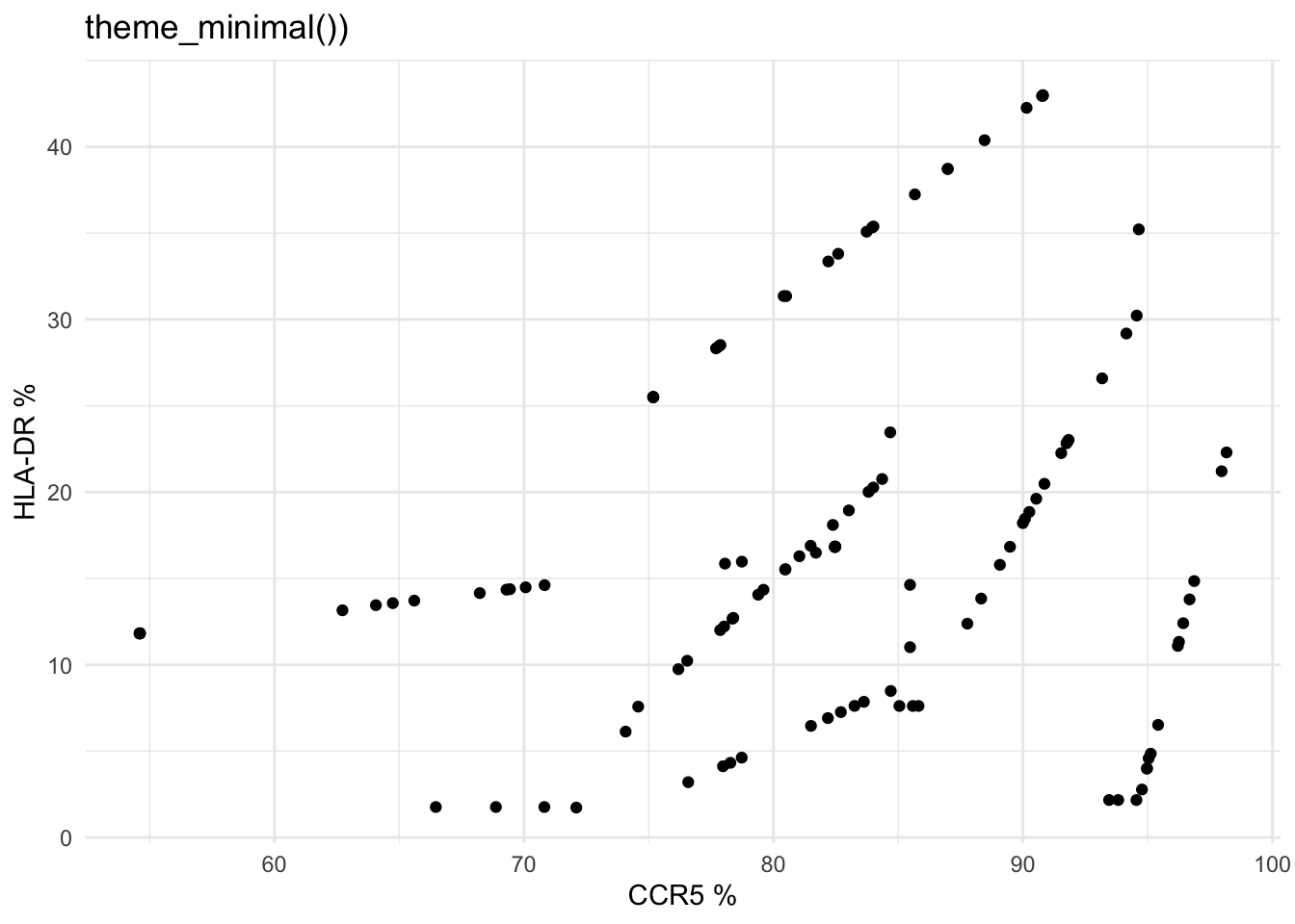
labs(title = "theme_minimal())", x= "CCR5 %", y= "HLA-DR %")+
theme_minimal()
Code
data %>%
  mutate(percent_CCR5 = 100*CCR5/CD4,
         percent_HLADR = 100*HLADR/CD4) %>%
  ggplot(aes(x = percent_CCR5, y = percent_HLADR))+
  geom_point() +
  labs(title = "theme_bw()", x= "CCR5 %", y= "HLA-DR %")+
  theme_bw()

Adjust the aesthetic attributes (categorical):
Changing the aesthetic will let us pull more information from the simple black dots
Code
data %>%
mutate(percent_CCR5 = 100*CCR5/CD4,
percent_HLADR = 100*HLADR/CD4) %>%
ggplot(aes(
x = percent_CCR5,
y = percent_HLADR,
color = tissue
))+
geom_point() +
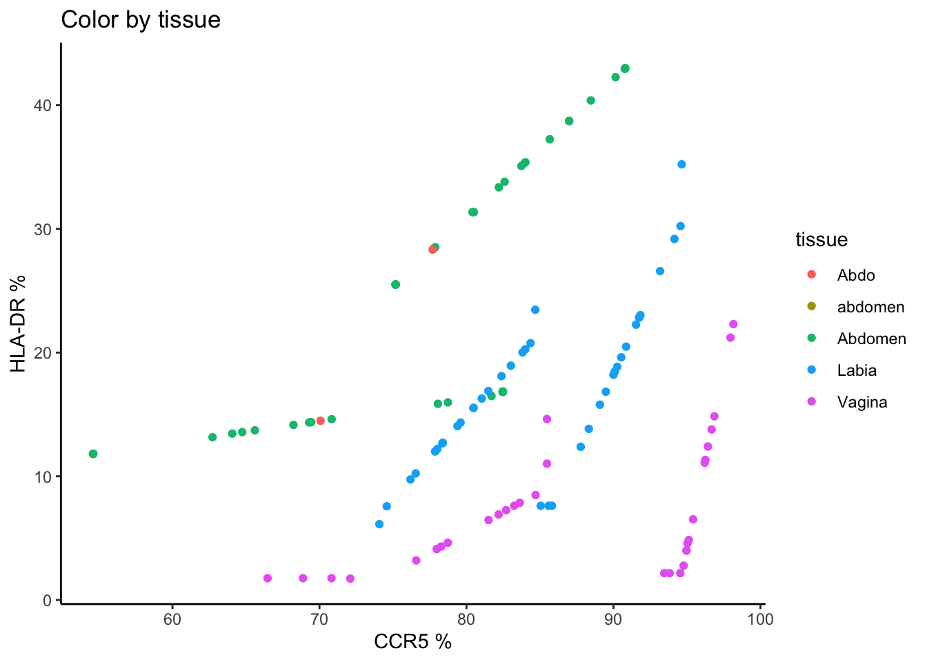
labs(title = "Color by tissue", x= "CCR5 %", y= "HLA-DR %")+
theme_classic()
Code
data %>%
  mutate(percent_CCR5 = 100*CCR5/CD4,
         percent_HLADR = 100*HLADR/CD4) %>%
  ggplot(aes(
    x = percent_CCR5,
    y = percent_HLADR,
    color = tissue
  ))+
  geom_point() +
  labs(title = "Color by layer", x= "CCR5 %", y= "HLA-DR %")+
  theme_classic()

Code
data %>%
mutate(percent_CCR5 = 100*CCR5/CD4,
percent_HLADR = 100*HLADR/CD4) %>%
ggplot(aes(
x = percent_CCR5,
y = percent_HLADR,
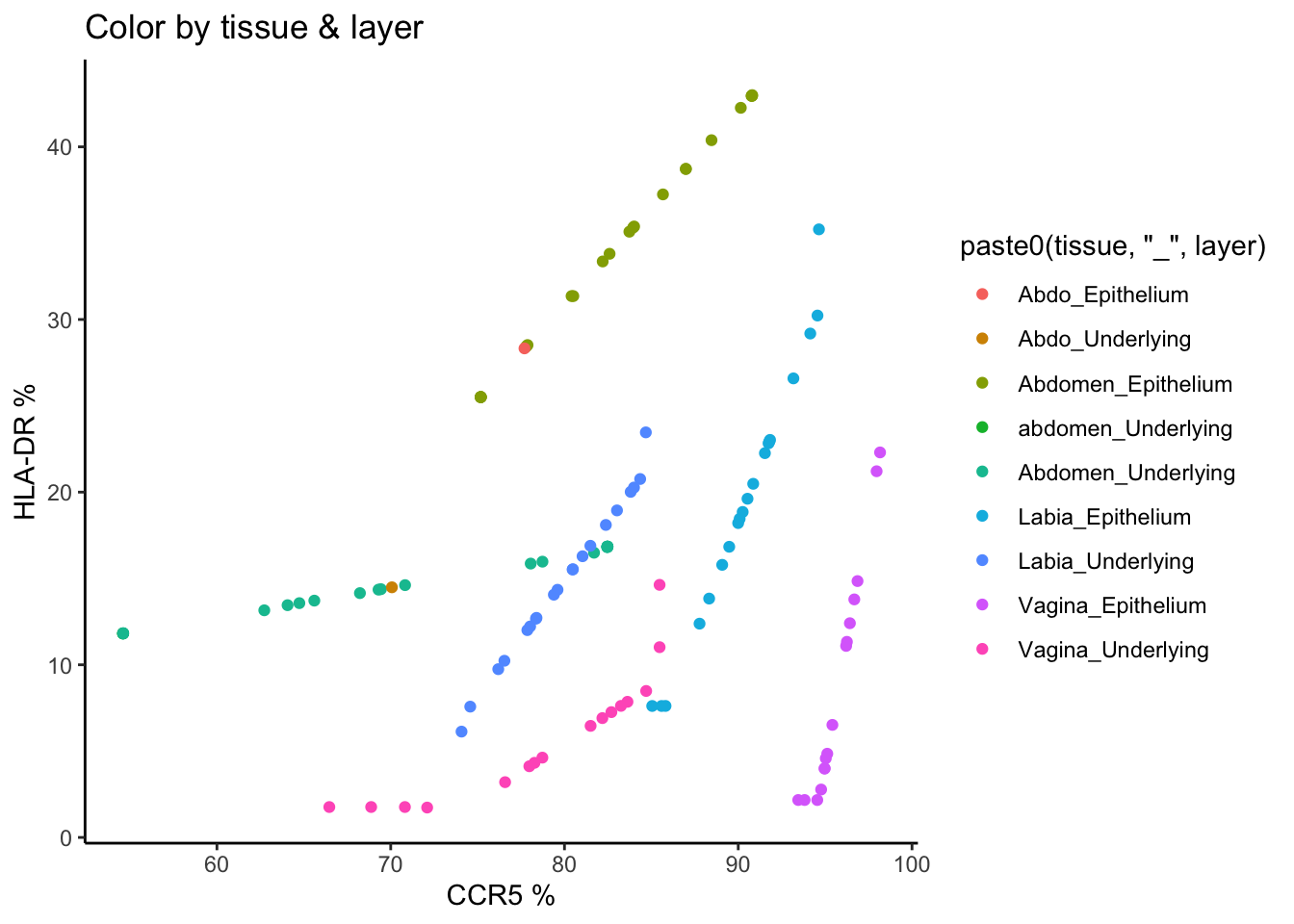
color = paste0(tissue, "_", layer)
))+
geom_point() +
labs(title = "Color by tissue & layer", x= "CCR5 %", y= "HLA-DR %")+
theme_classic()
Code
data %>%
mutate(percent_CCR5 = 100*CCR5/CD4,
percent_HLADR = 100*HLADR/CD4) %>%
ggplot(aes(
x = percent_CCR5,
y = percent_HLADR,
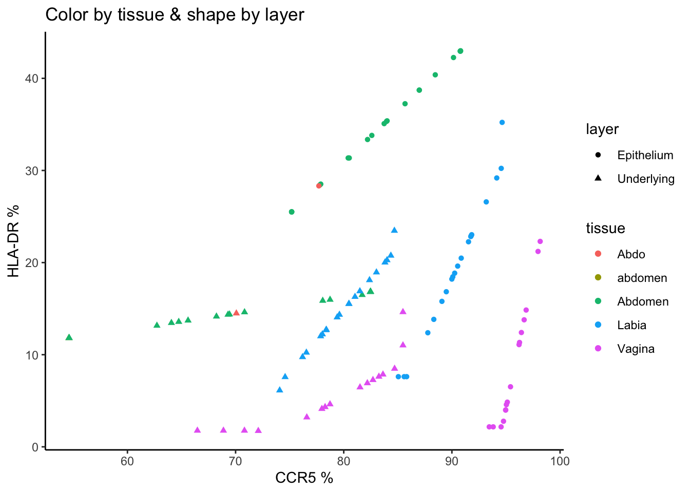
color = tissue,
shape = layer
))+
geom_point() +
labs(title = "Color by tissue & shape by layer", x= "CCR5 %", y= "HLA-DR %")+
theme_classic()
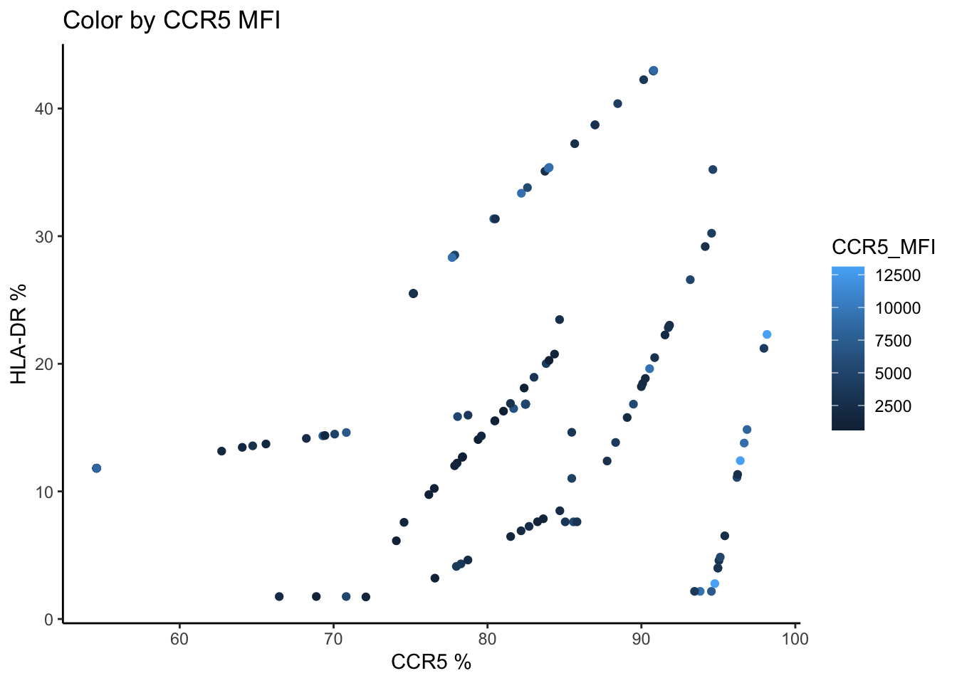
Adjust the aesthetic attributes (continuous):
We could add a third dimension here. X and Y are the percentage values, but what if we coloured the points by a third continuous value?
Code
data %>%
  mutate(percent_CCR5 = 100*CCR5/CD4,
         percent_HLADR = 100*HLADR/CD4) %>%
  ggplot(aes(
    x = percent_CCR5,
    y = percent_HLADR,
    color = CCR5_MFI
  ))+
  geom_point() +
  labs(title = "Color by CCR5 MFI", x= "CCR5 %", y= "HLA-DR %")+
  theme_classic()
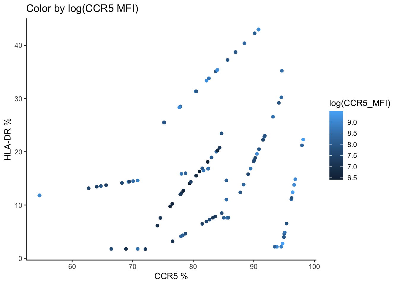
Code
data %>%
  mutate(percent_CCR5 = 100*CCR5/CD4,
         percent_HLADR = 100*HLADR/CD4) %>%
  ggplot(aes(
    x = percent_CCR5,
    y = percent_HLADR,
    color = log(CCR5_MFI)
  ))+
  geom_point() +
  labs(title = "Color by log(CCR5 MFI)", x= "CCR5 %", y= "HLA-DR %")+
  theme_classic()
Example Question
Which tissues are enriched for CCR5?
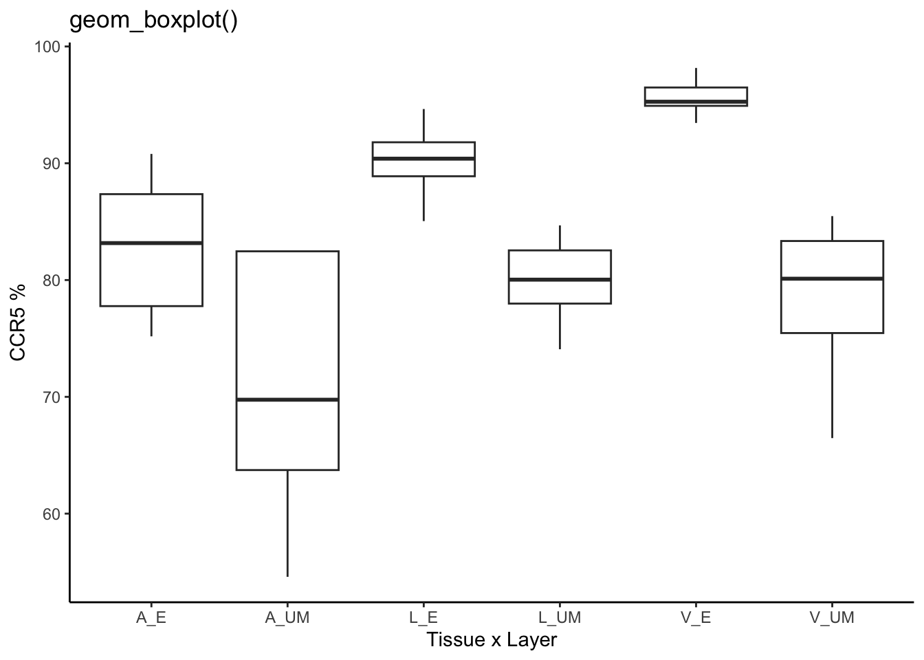
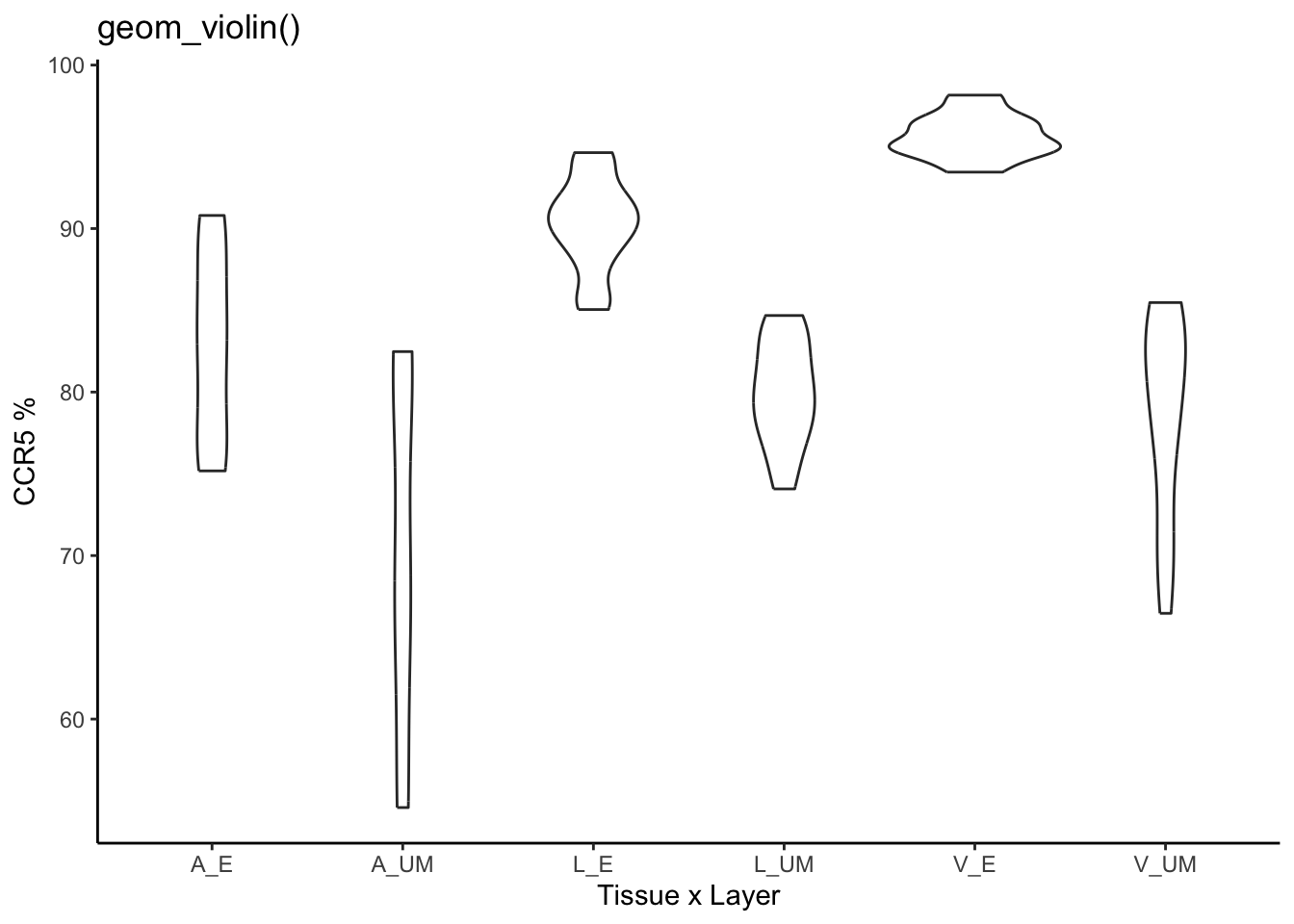
Boxplot
Boxplot vs Violin:
Code
data %>%
  mutate(percent_CCR5 = 100*CCR5/CD4) %>%
  ggplot(aes(
    x = group,
    y = percent_CCR5
  ))+
  geom_boxplot() +
  labs(title = "geom_boxplot()", y= "CCR5 %", x= "Tissue x Layer")+
  theme_classic()
Code
data %>%
  mutate(percent_CCR5 = 100*CCR5/CD4) %>%
  ggplot(aes(
    x = group,
    y = percent_CCR5
  ))+
  geom_violin() +
  labs(title = "geom_violin()", y= "CCR5 %", x= "Tissue x Layer")+
  theme_classic()
Combining layers - boxplot & points:
Code
data %>%
  mutate(percent_CCR5 = 100*CCR5/CD4) %>%
  ggplot(aes(
    x = group,
    y = percent_CCR5
  ))+
  geom_boxplot() +
  geom_point()+
  labs(title = "geom_boxplot() AND geom_point()", y= "CCR5 %", x= "Tissue x Layer")+
  theme_classic()

Code
data %>%
mutate(percent_CCR5 = 100*CCR5/CD4) %>%
ggplot(aes(
x = group,
y = percent_CCR5
))+
geom_boxplot() +
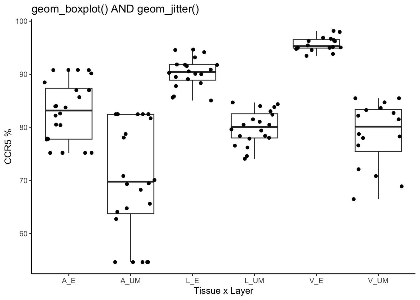
geom_jitter()+
labs(title = "geom_boxplot() AND geom_jitter()", y= "CCR5 %", x= "Tissue x Layer")+
theme_classic()
Code
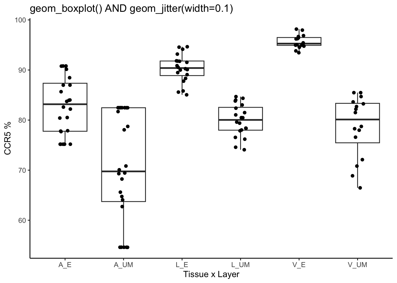
# The default jitter is width = 0.5 - we can reduce this
data %>%
  mutate(percent_CCR5 = 100*CCR5/CD4) %>%
  ggplot(aes(
    x = group,
    y = percent_CCR5
  ))+
  geom_boxplot() +
  geom_jitter(width=0.1)+
  labs(title = "geom_boxplot() AND geom_jitter(width=0.1)", y= "CCR5 %", x= "Tissue x Layer")+
  theme_classic()
Adjusting the aestheticss:
When you’re combining layers, like boxplot and point, you might want to change the aesthetic to each layer individually. So instead of changing the aes at the start, we can add aes inside the geom’s.
Code
# The default jitter is width = 0.5 - we can reduce this
data %>%
  mutate(percent_CCR5 = 100*CCR5/CD4) %>%
  ggplot(aes(
    x = group,
    y = percent_CCR5
  ))+
  geom_boxplot(aes(fill = group)) +
  geom_jitter(width=0.1, aes(color=age))+
  labs(title = "geom_boxplot(aes(fill=group))+geom_jitter(aes(color=age))", y= "CCR5 %", x= "Tissue x Layer")+
  theme_classic()

Example Question
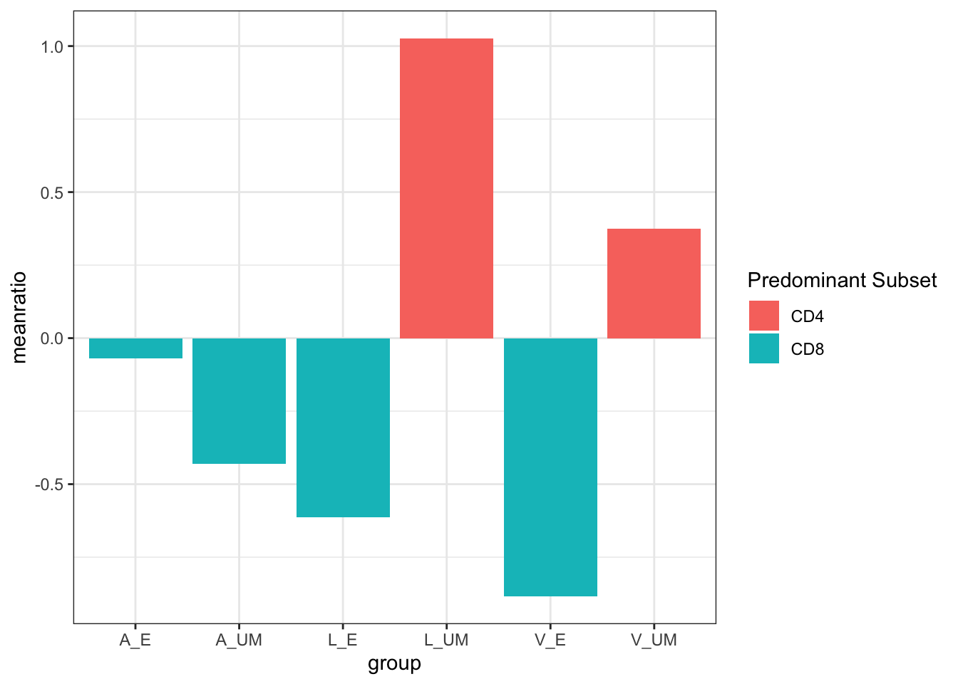
What is the ratio of CD4:CD8 per tissue and layer?
Column/bar graph
Column/bar graphs are useful for summary graphs and/or statistical transformations (such as counts or histograms).
Column graph:
Code
data %>%
  mutate(ratio = log(CD4/CD8)) %>%
  group_by(group)%>%
  summarize(meanratio = mean(ratio))%>%
  mutate(`Predominant Subset` = ifelse(meanratio<0, "CD8", "CD4"))%>%
  ggplot(aes(x=group, y=meanratio, fill=`Predominant Subset`))+
  geom_col()+
  theme_bw()
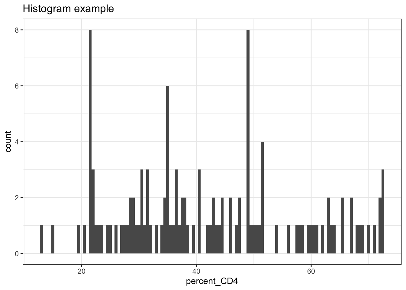
Example of statistical transformations (Histogram/Bar graph):
Code
data %>%
  mutate(percent_CD4 = 100*CD4/CD3,
         percent_CD8 = 100*CD8/CD3) %>%
  ggplot(aes(x=percent_CD4))+
  geom_histogram()+
  theme_bw()+
  ggtitle("Histogram example")
## `stat_bin()` using `bins = 30`. Pick better value with `binwidth`.

Code
# change the bin width to add more resolution
data %>%
  mutate(percent_CD4 = 100*CD4/CD3,
         percent_CD8 = 100*CD8/CD3) %>%
  ggplot(aes(x=percent_CD4))+
  geom_histogram(binwidth = .5)+
  theme_bw()+
  ggtitle("Histogram example")
Code
data %>%
  mutate(predominant = ifelse(CD4>CD8, "CD4", "CD8")) %>%
  ggplot(aes(x=predominant))+
  geom_bar()+
  theme_bw()+
  ggtitle("Bar graph example: Number of samples that are predominantly CD4 or CD8")

Summary
With these simple examples, you should have an idea of how to make and customise ggplots for your data.
The next chapter will build upon these, such as changing the theme elements, customising the colours, combining and then saving your plots.
Next chapter →